ShopDreamUp AI ArtDreamUp

Deviation Actions


Suggested Collections


You Might Like…


Featured in Groups


Description
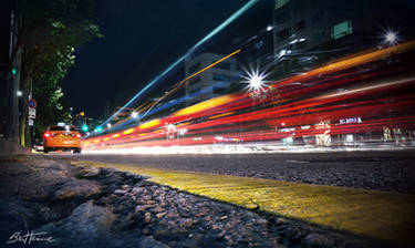
This was taken as part of my final project in a digital photography course at California College of the Arts. It's a 10 second exposure in downtown San Fransisco. The version that I submitted there was a lot more contrasty, over-saturated, and had boring lighting. I fixed it.  Enjoy.
  (Wink)")
Critique questions: Does the cropping feel good in this? Do the highlights seem too blown out? Does the lack of detail in the shadows seem appropriate? Are the colors realistic enough while still seeming unique to what you would expect? Do the vignetting and blurring seem appropriate, or are they over-done?
Critique questions: Does the cropping feel good in this? Do the highlights seem too blown out? Does the lack of detail in the shadows seem appropriate? Are the colors realistic enough while still seeming unique to what you would expect? Do the vignetting and blurring seem appropriate, or are they over-done?
Image size
4386x2670px 6.03 MB
Make
NIKON CORPORATION
Model
NIKON D200
Shutter Speed
10/1 second
Aperture
F/22.0
Focal Length
50 mm
ISO Speed
100
Date Taken
Mar 14, 2005, 12:18:33 AM
Comments3
Join the community to add your comment. Already a deviant? Log In
Brought to you by
<img class="avatar" src=a.deviantart.net/avatars/t/h/t… alt="
 " title="The-Photo-Critics"/>
Silence my soul... hmm okay I have to say this that the name well doesn't go with the whole photograph. It could have gone as I get what you wanted to portray but to be very honest it ain't...
Does the cropping feel good in this?
Yes I love the cropping and I love the dark edges they were needed
Do the highlights seem too blown out?
YES!!! The highlights seem to be blown out, they are way to blur
Does the lack of detail in the shadows seem appropriate?
Okay now this is the main thing I wanted to answer, I get your point, I love the whole effect it is something which I'd definitely put on as my desktop wallpaper but but but!! THE SHADOW!! The shadow should have been the most prominent thing in this photograph... That should have been the most important detail...
Are the colors realistic enough while still seeming unique to what you would expect?
Colors are realistic and I still consider this photograph unique <img src="e.deviantart.net/emoticons/s/s…" width="15" height="15" alt="
Do the vignetting and blurring seem appropriate, or are they over-done?
Too much blur at points, vigenetting is good
To speak technically photography is the art of writing with light. But if I want to think about it more philosophically, I can say that photography is the art of writing with time. When you capture an image you capture not only a piece of space, you also capture a piece of time. So you have this piece of specific time in your square or rectangle. In that sense I find that photography has more to do with time than with light. So lighting was perfect just the absence of time and details made this photograph not get the response it deserved...
For more comments and feed back you can check out my gallery <img src="e.deviantart.net/emoticons/s/s…" width="15" height="15" alt="